Your Question Becomes a Living Chart
Phaide AI's plot rendering is the engine that turns analysis into visuals. When you ask a question in plain language, the AI writes the analysis, runs it against your data in a secure sandbox, and renders the result as an interactive chart embedded right in your conversation, dashboard, or discovery report.
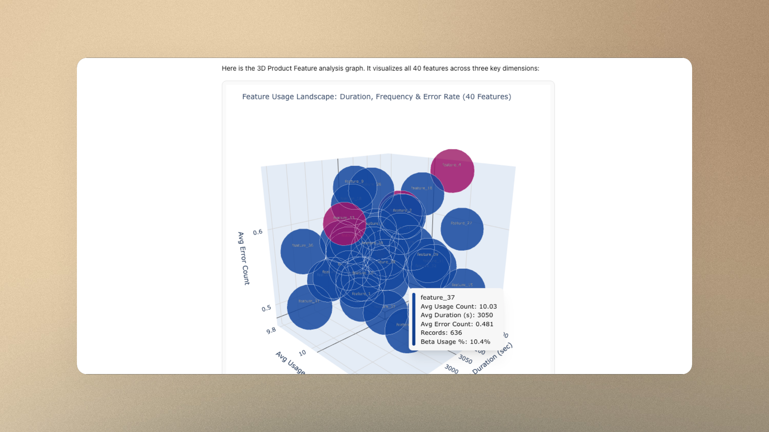
Because the AI composes each chart programmatically rather than picking from a fixed menu of widgets, the range of what it can draw is unusually wide. Line, bar, and pie charts are the floor, not the ceiling. The same engine produces 3D scatter plots and surface charts you can rotate with your mouse, heatmaps, multi-panel layouts, KPI indicators, and graphs carried by annotations — reference lines for averages, vertical markers for key events, and titles written as a conclusion rather than a label.
The AI also follows a consistent visual language so charts look like they belong together: a unified color treatment, color used to draw the eye to the one point that matters, and every chart built to make a single argument rather than dump a table of numbers on screen.
Every chart is interactive by default. You can hover for precise values, zoom and pan, spin a 3D view to any angle, reset the view with one click, and download the figure as a PNG to drop into a deck.
Where Other BI Tools Stop, Phaide Keeps Going
Most BI tools hand you a gallery of preset chart types. That gallery is also a wall: if 3D isn't in it, you don't get 3D, and annotating a chart means exporting it and marking it up by hand in another app. The expressive range is capped by whoever built the widget list.
Phaide removes that wall. Three-dimensional relationships — three metrics plotted against each other, a response surface, a cluster in space — become charts you can actually turn and inspect, not flat approximations. Annotations are treated as a first-class part of the story: the AI is guided to call out the moment a campaign launched, draw the average as a baseline, and put the headline finding in the title. The result is a chart that argues a point, not just one that displays numbers.
This matters because a visual that can be rotated, annotated, and explored is a visual people trust and remember. You spend your time reading the insight instead of fighting a chart builder to express it.
It also collapses the usual round trip. There is no exporting to a spreadsheet, no dropping the image into a design tool to add labels, no separate plugin for the one chart type your dashboard vendor left out. The analysis, the visualization, and the annotation all happen in the same place, from the same plain-language request — which means the chart you share is the chart the AI just reasoned about, with nothing lost in translation.
From Plain English to a Rotatable Chart in Three Steps
There are three places the plot rendering engine works, and each takes the same few steps.
In Chat. Open a chat, type your question in the message box at the bottom — for example, "Plot revenue against ad spend and order volume in 3D" — and send it. The AI runs the analysis and the interactive chart appears inline in the conversation. Hover, zoom, rotate, or download it straight from there. Toggle Discover next to the input if you'd like the AI to explore the data from several angles on its own.
In Discover. For hands-off analysis, open the Discover view, choose how deep to go — Quick, Standard, Detailed, or Comprehensive — and press Start Analysis. Phaide investigates your data in parallel and assembles a report with interactive charts embedded throughout, which you can read on screen or Download to share.
In Dashboards. Ask Phaide to build a dashboard and it generates a grid of live widgets — KPI tiles and interactive charts side by side — that refresh against your data and can be resized and rearranged.
In every case you write a sentence; the chart that comes back is interactive, annotated where it helps, and ready to share. And because every chart is built from analysis the AI actually ran against your data — not a template filled in with guesses — what you see on screen reflects the real numbers behind it. If you want a different cut, you simply ask again in the same conversation, and a new chart takes its place.
Stop Settling for the Chart Your Tool Happens to Offer
Your data deserves more than a flat bar graph chosen from a dropdown. With Phaide AI, the chart bends to the question — rotating in three dimensions, carrying its own annotations, and telling the story you actually came to tell. Ask once, and watch the picture come to life.
FAQ
What kinds of charts can Phaide create? A broad range — line, bar, area, pie, scatter, heatmaps, multi-panel layouts, and KPI indicators, plus 3D scatter and surface charts. Because each chart is generated as code from your request, you're not limited to a fixed list of widget types.
Are the charts interactive or just static images? Interactive. You can hover for exact values, zoom, pan, rotate 3D views, and reset the view at any time. Each chart can also be downloaded as a PNG when you need a static copy.
Can it really make 3D charts? Yes. When three variables matter, Phaide renders true 3D scatter and surface plots that you rotate and inspect from any angle — not flattened two-dimensional stand-ins.
What does "annotated" mean here? The AI adds explanatory elements directly onto the chart: reference lines for averages, vertical markers for important events, and a title written as the key takeaway, so the chart communicates a conclusion rather than just raw numbers.
Where do the charts appear? In three places: inline in your chat conversations, embedded in Discover reports, and as live widgets on dashboards.
Can I share or export a chart? Yes. Any chart can be saved as a PNG, and full Discover reports can be downloaded to share with your team.
Do I need to know how to code or pick a chart type? No. You describe what you want to see in plain language, and Phaide chooses the appropriate visualization, builds it, and renders it for you.